Real estate market in the city of Barcelona
-
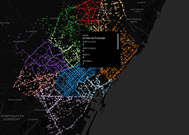
 Sergio García Pérez
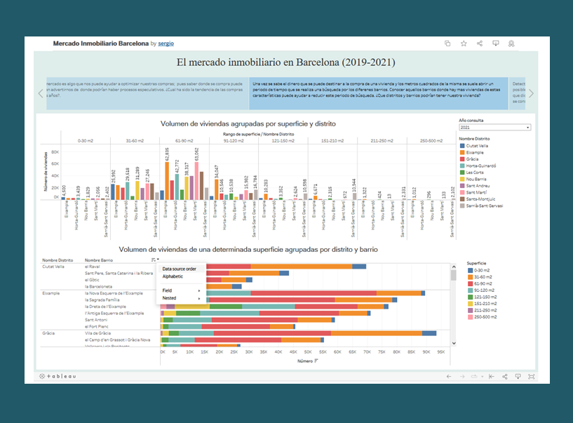
Sergio García Pérez, presents the visualization of the Real Estate Market in the city of Barcelona in which, through multiple dashboards, he intends to help guide all citizens about the situation in this sector, and in particular those who may be interested in buying a home.
The datasets used, published on the Open Data BCN portal, are those referring to Purchase of registered properties, Cadastral premises and Tourist housing.
-
 Nico Sentís
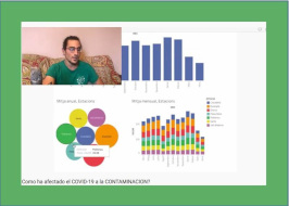
Nico Sentís, a graduate in physics and a fan of permaculture, presents in this videoblog the visual study he has made of the air quality in the city of Barcelona during the lockdown due to COVID-19. These are the used datasets published on the Open Data BCN portal.
Source: Open Data BCN
-
 Nathalie Richer
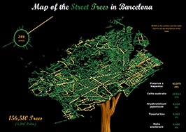
Nathalie Richer has created an interactive visualization called Map of the street trees in Barcelona with the localisation of the trees and distribution of the most present species. It has been made using the available API in the dataset Street trees of the city of Barcelona and on theTableau platform.
Source: Open Data BCN
-
 Juanjo Vidal
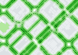
The geographer Juanjo Vidal has produced a visual display of roadside trees in Barcelona based on data published on the city’s Open Data portal, which has more than 170,000 entries. It should be borne in mind that the roadside tree concept corresponds to trees by the side of roads. Therefore, it does not include either park or area trees, as these are treated differently.
Source: Open Data BCN
-
 Lluís Esquerda
Also, Lluís Esquerda, a data extraction professional who we have already interviewed in the section Interviews, has used data published on Open Data BCN to produce the BarcelonaBicing status map. You can see the number of bikes available at each of the stations spread around the city in real time.
-
 Jesús Hernández
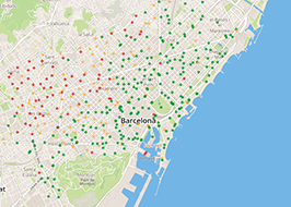
 Jesús Hernández makes this visualization in which he shows, by typology, the total of accidents by districts and neighbourhoods managed by the Guardia Urbana of Barcelona in the year 2019.
The author, through the representation and analysis of the data, concludes that the district where the most accidents are concentrated is the Eixample, relating this greater number to the volume of traffic and pollution. In the same way, he takes the opportunity to make us observe that in the dataset used, Accidents managed by the Guàrdia Urbana in the city of Barcelona according to type, the origin of the person involved in the accident is not published, and perhaps if that data were available, it could be verified that only 10% of traffic accidents in the Eixample involves its neighbors.
He also believes that if the Barcelona City Council instead of opting for the ZBE, Zona de Baixes Emissions Rondes BCN, would have chosen to copy the Madrid Central car access system and apply it to the Eixample, there would not be so much pollution, noise and accidents in all of Barcelona and its metropolitan area.
Source: Open Data BCN
-
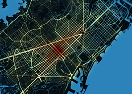
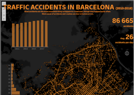 Nathalie Richer
 Nathalie Richer, has created the visualization Traffic accidents in Barcelona (2010-2018) with data published in Open Data BCN.
With the dataset of Accidents managed by the Guàrdia Urbana in the city of Barcelona , represents in a heat map, the volume and the average by day of accidents, with data from 2010 to 2018. It allows to filter by year, time of day, type of accident, day of the week and district. By selecting 'Hot spots by district', you get a detail of the hot spots of accidents that took place in the different districts in the city between 2016 and 2018.
Source: Open Data BCN
-
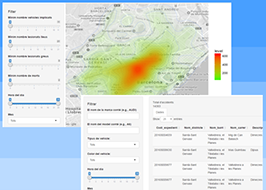 Didier Domínguez
 Didier Domínguez , a mathematician and user of the Open Data BCN portal, has developed interactive visualizations in 2016. The first one, with the dataset Accidents managed by the Guàrdia Urbana of the city of Barcelona , represents on a heat map, the number of accidents filtered by different concepts: accidentality, involved vehicles, time, day ... The second one, with dataset information from Vehicles involved in accidents handled by the police in the city of Barcelona , allows to consult the vehicles involved by brand, model and type and by district, neighbourhood and street.
Font: Open Data BCN
-
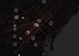
 Iban Tarrés
Iban Tarrés, a geographer and technician at GIS, has developed an interactive visualization consisting of a cumulative point map in which chronologically each of the interventions carried out by the body of agents of the Urban Guard of the city of Barcelona during the 2016. It gives information of the total, the day strip and the district in which the accidents that we visualize at that moment in the screen have occurred.
Source: Open Data BCN
-
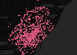
 Víctor León
The geographer Víctor León, founder partner of GESTAMBIT, produced various visualizations using his CartoDB profile. We highlight the accumulative heat map, a dynamic map that draws the areas of the city with the most accidents.
Source: Open Data BCN -
 Juanjo Vidal
The geographer Juanjo Vidal has also produced a visual display of the portal data set from his CartoDB account. In this case, it is a dynamic, chronological map of the accidents handled by the Guàrdia Urbana in 2014.
Source: Open Data BCN -
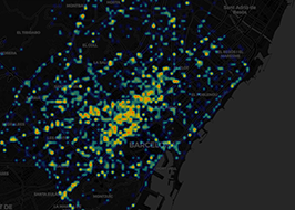
 Carlos Carrasco
Another portal data visualization regular is Carlos Carrasco, a researcher at the Cities in Motion centre of the IESE Business School and a Eixos.cat partner. Carrasco has also made various portal visual displays, which he has in his Twitter profile and here we highlight the map showing the total number of accidents in 2014.
Source: Open Data BCN
-
 Diego Villuendas
Diego Villuendas is yet another portal user who has produced a visual display of the data set using CartoDB technology (here is his profile). In his case, the map uses two layers that represent the accidents according to the time of day they occurred and the day of the week they took place.
Source: Open Data BCN
-
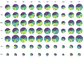 TeamUNO
The people of TeamUNO (you can follow them on their Twitter profile), which came out of the UB postgraduate course on Data Science and Big Data, have come up with the first visualization of the trend in accidents handled by the Guàrdia Urbana in Barcelona between 2010 and 2014. The one we highlight corresponds to the time spread, by day of the week and month, in 2014.
Source: Open Data BCN
Air quality of the city of Barcelona
Street trees of the city of Barcelona
Bicing Stations of the city of Barcelona (Mechanics and electrics)
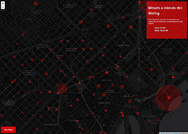 SIGTE de la Universitat de Girona
The SIG i Teledetecció (SIGTE) de la Universitat de Girona service has produced a dynamic web map about the activity of the Bicing service in the working day 17th October 2017. The data used are from the dataset Bicing Stations of the city of Barcelona (Mechanics and electric) from the Open Data BCN portal.
This application, programed in Python, stores in a PostGis database the number of bicycles picked up by the users in every station, minute by minute. This data, along with the temporal variable, is what is used to create the application and to show in an accelerated rate the activity in all the Bicing stations of the city. The source code is available in SIGTE’s GITHUB.
More information in SIGTE’s blog.
Source: Open Data BCN
https://datascientistassoc
Add new comment
Log in or register to post comments